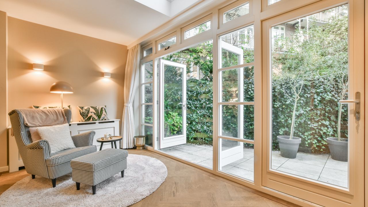
I have become increasingly suspicious of rooms that look too perfect.
You know the type: the boucle chair, the oversized vase, the coffee-table book placed at exactly 37 degrees, the neutral artwork that could belong to anyone, anywhere, at any price point. Technically, nothing is wrong. The proportions work. The palette is tasteful. The lighting is soft. And yet the room has no pulse.
For years, interiors were sold to us as something to “achieve.” We were told to make our homes look expensive, current, cohesive. But the most interesting homes I walk into now are not the ones that look most polished. They are the ones that feel most specific. They hold evidence of a life: a city once lived in, a coastline returned to every summer, a country crossed by train, a place still waiting on the list.
That, to me, is the new luxury. Not a bigger sofa. Not another beige-on-beige arrangement. A home that knows where you’ve been.
Table of Contents
Why place has more power than pattern
I have nothing against beautiful pattern, texture, or color. But none of them can compete with personal geography. A stripe may be stylish. A map of a place that changed you is intimate.
This is why place-based art has such unusual staying power. A trend-led print can look tired in a few seasons because its value depends on fashion. A meaningful place ages differently. It becomes richer. The longer you live with it, the more it gathers memory.
Environmental psychologists talk about “place attachment” — the emotional bond people form with locations that become part of their identity. I think most of us understand this instinctively. We do not simply remember places as backdrops. We remember who we were there. The apartment where we started again. The island where time slowed down. The city that made us braver. The road trip that rearranged our priorities.
When that kind of place enters a room as art, it stops behaving like decoration. It becomes a quiet autobiography.
And this is where many interiors go wrong. They ask, “What would look good above this sofa?” I think the better question is, “What should this wall remember?”
The map as a declaration of character
A map is one of the few pieces of wall art that can feel intellectual, emotional, and architectural at the same time. It brings scale into a room. It suggests curiosity. It has a way of making even a very still space feel in motion.
I especially like maps in living rooms, dining areas, studies, and home offices — rooms where conversation naturally happens. A large piece of world map wall art does not need to shout for attention. It invites attention. Guests drift toward it. They point. They remember. They ask questions. Suddenly, the wall is not merely dressed; it is participating.
The mistake is treating map art as a novelty item. It should not feel like something bought for a student dorm or a travel agency wall. The most successful map pieces are chosen like serious art: by scale, tone, finish, and relationship to the room.
A soft vintage map can warm up a library or traditional interior. A monochrome world map can sharpen a modern apartment. A muted neutral map can sit beautifully above a linen sofa without overpowering the space. The subject may be global, but the execution has to be deeply local to the room.
My rule is simple: if the map is the idea, let it be large enough to matter. Small map prints scattered around a room can feel decorative. One generous, well-framed map feels intentional.
Children’s rooms deserve better than disposable decor
I have a strong opinion about children’s interiors: they should not be designed to expire in two years.
So much nursery decor is painfully short-lived — sweet for a photograph, then quickly too babyish, too themed, too tied to a passing color trend. Parents end up replacing it before the room has had time to develop any real feeling.
That is why I love the idea of using geography in a child’s room. A map in a nursery is not just cute. It carries a larger message: the world is wide, layered, and waiting.
A gentle piece of nursery world map wall art can do what the best children’s decor should do — feel warm now, but still relevant later. Babies grow into toddlers who point at animals and shapes. Toddlers become children who ask where grandparents live, where the ocean is, where the plane went, where they might go one day. The artwork grows with the conversation.
That matters. A child’s room should not be a miniature showroom. It should be a place where imagination has somewhere to land. A world map gives that imagination structure without limiting it.
I would style it simply: a warm wood frame, a low book ledge, perhaps a globe, a soft rug, and enough negative space for the wall to breathe. Avoid turning the room into a “travel theme.” Themes flatten things. A good map opens them up.
The coast belongs in rooms where the body needs to soften
Not every place-based artwork needs to carry ambition or story. Some places matter because they calm the nervous system before we even understand why.
For many people, that place is the sea.
Many of these misconceptions come from outdated approaches to coastal interior design, where decorative themes often overshadow the calm, timeless feeling that coastal spaces can create. But the sea itself is not a cliché. It is elemental. It is rhythm, distance, air, horizon, light.
Research around blue spaces — oceans, lakes, rivers, and even visual cues of water — supports what people have always felt: water helps us slow down. That is why coastal artwork can be so effective in bedrooms, bathrooms, reading corners, and spa-like spaces. It gives the eye somewhere restful to go.
A piece of beach wall art works best when it is chosen for mood rather than theme. I prefer quiet horizons, softened waves, misted shorelines, and tonal blues that feel atmospheric rather than decorative. The goal is not to announce “beach house.” The goal is to change the emotional temperature of the room.
In a bedroom, I would avoid aggressive surf, high contrast sunsets, or anything too energetic. Save drama for the hallway. In spaces meant for rest, the artwork should feel like a lowered voice.
How to make place-based art feel sophisticated
The difference between meaningful and messy is discipline. A home can be filled with personal references and still feel refined, but only if the choices are edited.
First, scale matters. Most people buy art too small. If a piece is going above a sofa, bed, console, or dining bench, it needs enough presence to anchor the furniture below it. A timid print makes even a beautiful wall feel unfinished.
Second, keep the palette in conversation with the room. It does not have to match perfectly — in fact, it should not — but it should belong. A warm-toned map can echo wood, brass, leather, or terracotta. A coastal print can pick up linen, stone, pale oak, or muted blue. The connection can be subtle, but it has to be there.
Third, choose frames with intention. Framing is not an afterthought; it is part of the artwork’s voice. Slim black frames feel graphic and architectural. Oak feels relaxed and modern. Walnut adds depth. White or pale wood can make coastal work feel lighter. The wrong frame can cheapen a good piece instantly.
Finally, resist over-explaining. One meaningful place on a wall is powerful. Five competing memories in one room can become noise. Let each room have one clear emotional geography.
A home should not look like it was solved by an algorithm
The interiors I believe in are not random, but they are not sterile either. They have rhythm, memory, and a point of view. They are edited, but not emptied of personality.
That is why I keep coming back to place-based art. It does what good design is supposed to do: it makes a room more beautiful while making it more true. It gives a wall a reason to exist beyond filling space.
A map can hold the world you have crossed. A nursery map can hold the world you are handing to a child. A coastal print can hold the place your mind goes when it needs rest.
This is the kind of decorating I trust now — not performance, not perfection, not another room assembled from whatever the internet currently agrees is tasteful.
A real home should reveal something. It should point somewhere. It should, in small and quiet ways, tell the truth about the person living there.
Start with the place you would circle first. The room will know what to do next.