
Order confirmation screens are crucial to the user experience for any e-commerce or digital service. These screens provide reassurance to customers by confirming that their transaction was successful and supplying all pertinent details about their purchase. Carefully crafted confirmation screens not only reduce post-purchase anxiety but also strengthen the business-customer relationship. For excellent visual inspiration, designers often review confirmation page UI examples from leading platforms.
Ensuring best practices in the structure and presentation of order confirmation screens can elevate user satisfaction and foster long-term brand loyalty. Thoughtful design choices aid in clear communication, reduce errors or customer confusion, and create new opportunities for engagement and revenue. In today’s digital landscape, where immediate trust and convenience are vital, an optimized order confirmation experience can set your brand apart from competitors.
From clarity in transaction details to opportunities for upselling, each facet of the confirmation screen should be purposefully designed. Maintaining a consistent visual identity and prioritizing mobile usability strengthen user confidence. These considerations are not limited to just aesthetics; they reinforce the reliability and professionalism expected by modern shoppers.
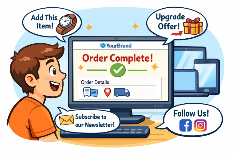
Table of Contents
Clarity and Concise
Transparency and accuracy are critical to effective confirmation screens. Users need to see a succinct, itemized summary of their purchase, including product names, quantities, prices, and order numbers. Omitting or burying key details can sow doubt and frustrate customers. Leveraging whitespace, clear headings, and readable font sizes helps eliminate clutter and ensures that users can confirm the details at a glance.
Brand Consistency
Reinforcing brand identity is essential on all post-purchase screens. The use of your brand logo, colors, and standard typography ensures customers immediately recognize they are still engaging with your organization. Consistency in design elements instills confidence in the legitimacy of the transaction and helps reduce cart abandonment caused by jarring visual style changes. Every touchpoint, including confirmation screens, should reflect a unified brand voice that strengthens recall and customer loyalty over time.
Mobile Responsiveness
Order confirmation screens must be easily accessible on any device. With a majority of users completing purchases via smartphones and tablets, mobile responsiveness is no longer optional. Responsive designs should automatically adapt to varied screen sizes, ensuring that fonts remain readable, images load quickly, and buttons are easy to tap. Minimizing scroll, offering collapsible sections, and clearly labeling navigation elements are all critical for seamless mobile experiences.
Upselling Opportunities
Order confirmation is one of the highest points of user engagement. After a successful transaction, customers are more likely to consider additional purchases. By displaying targeted recommendations for related products or services, businesses can naturally increase average order value. Suggestions should feel helpful rather than intrusive; the focus should be on items that genuinely complement the just-purchased product, such as protective cases for electronics or special discounts on next orders. This approach not only drives incremental sales but also enhances personalized service. Learn more about upselling and cross-selling strategies to better understand how predictive insights can improve revenue opportunities.
Customer Engagement
Effective confirmation pages do more than display order details. They provide convenient ways for users to continue engaging, such as encouraging account creation, newsletter sign-ups, or review submissions. Calls to action should be clear and strategically placed. Customers can also be asked to follow brand channels on social platforms or join loyalty programs, fostering community and repeat business. Collecting feedback or encouraging reviews at this stage helps businesses learn from user experiences and improve future services.
Testing and Optimization
The process of refining order confirmation screens should be ongoing. Regular A/B testing different layouts, copy variations, and upsell strategies helps businesses discover what resonates best with customers. Monitoring user interactions, error rates, and feedback can uncover usability issues and inform further optimizations. Continually analyzing metrics such as completion rates and engagement ensures confirmation pages evolve alongside changing customer expectations and technological trends.
Final Thoughts
In summary, order confirmation screens are powerful touchpoints that, when designed with care, deliver peace of mind, foster trust, and build a foundation for ongoing customer loyalty. By applying best practices for clarity, brand consistency, and mobile accessibility, and by integrating opportunities for upselling and engagement, businesses can maximize the value of each transaction touchpoint.