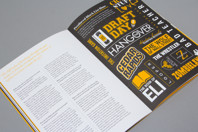
Editorial design is responsible for organizing and transmitting messages, information or texts in an optimal and attractive way by means of sans serif fonts, it is the one behind the visual aesthetics in magazines, books and any editorial publication, whether printed or digital.
Unlike the conventional graphic design that we are used to hearing about, editorial design is not associated with the intention of selling (product marketing) but to entertain or organize texts and extensive information.
The creative process of editorial design (as well as that of conventional graphic design) varies according to its author, however, its bases are practically constant and even somewhat similar to the process of graphic design.
Features
Editorial design regardless of where it is presented (magazines, books, etc.) tend to share the same characteristics, these are:
- The format: Depending on the information written, an appropriate format and free fonts must be chosen for it, be it an infographic, a book, a manifesto, or an essay, among others. Whether they are printed or digital.
- Typography: the designer must be especially attentive to this feature, especially when designing a cover since the proper choice of the font of a text will create a visual impact on the reader.
- Grid: editorial design thrives on the order and coherence that the grid attributes to the plane and the organization of the design is almost always delimited by one.
- Colour: The designer will be in charge of choosing the ideal colour combination to effectively transmit the information of the text, using the psychology of color or the same sensation that the writing transmits.
- Graphic elements: They are all those elements or images that help to facilitate the understanding of the text and enhance its aesthetic value. Use can be made of any image, illustration, map, ornament, etc.
Reticles
The grid is a set of lines that limit a plane vertically and horizontally in order to order the space.
Some of the most commonly used types of reticles are:
- Manuscript: also known as a one-column grid, it is characterized by organizing the text in a single block, leaving a margin at the top and bottom, as well as on the sides. It is commonly used in books, essays, legal documents or letters
- Columns: Organize the information in vertical columns on the plan, these can be two or more, this will depend on the format and is normally used to organize very long texts. We can commonly find it in newspapers.
- Modular: it is one of the most versatile since it organizes the information in such a way that it creates repetition in the format, having the greatest opportunity for combination and alignment. It also has the virtue of bringing together the characteristics of the previously exposed reticles in a single plane. It is mostly used in infographics, and magazines, among others.
- Hierarchical: It is a little freer in terms of composition, however, it is still ordered. Its objective is to give greater prominence to the most important information, modifying for this the size of the modules, the number of columns and blank spaces, creating order and dynamism.


