As of 2019, there are an estimated 253 million people worldwide who are visually impaired or blind. Unfortunately, many websites and digital platforms lack the necessary functionality to support these individuals. This can have major implications on their ability to access information online and other basic activities that most take for granted. It’s important to understand the challenges faced by those with visual impairments so that we can create strategies for promoting readability and accessibility for all users regardless of their abilities. In this blog post, we will explore some best practices that should be followed when creating content with the goal of making it more accessible for the blind community.
Accessibility for the Blind
One of the major barriers to access experienced by those with visual impairments is an outdated or nonexistent website design. For example, many websites fail to meet Web Content Accessibility Guidelines (WCAG) which are designed to make content more accessible for individuals with disabilities. Additionally, some websites may lack features like alt-text descriptions on images and videos as well as closed captioning options on audio files—all of which are necessary in order for blind users to be able to understand and navigate successfully through a website.
Ontop of designing websites that comply with WCAG standards, it’s important for developers and designers alike to be mindful of how their decisions affect accessibility when creating digital products. This could include using high-contrast colors so that text can be easily distinguished from background elements; implementing keyboard shortcuts instead of relying solely on mouse clicks; providing audio cues or voice commands when possible; setting clear focus states; avoiding multiple modal windows which can create confusion; and designing user interfaces that take into account the abilities/disabilities of all users.
Tools to Improve Readability
In addition to screen readers and Braille displays, which are essential tools for visually impaired users, there are other ways to improve readability. For example, web developers can use font size and contrast settings that make text easier to read for those with low vision. They can also provide options such as zoom controls or page reflow so that the user can adjust the appearance of the content in order to suit their individual needs. Additionally, providing descriptive labels on elements like form fields or buttons helps blind users understand what they mean without needing visual cues.
Alternative Braille Solutions
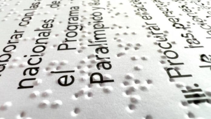
Alternative Braille solutions have been developed to provide a more convenient way for the visually impaired community to access and interact with digital content. One such solution is Refreshable Braille Displays (RBDs) which use sets of mechanical pins arranged in a cell structure to display braille characters. These devices connect via Bluetooth or USB port, allowing users to read text from their computer, smartphone, or other device without having to rely on tactile input methods like stylus and paper. Additionally, RBDs can be used as an output device so that users can type out messages using electronic braille keyboards while still benefiting from the tactile feedback provided by the pin-based design.
Audiobooks have also become increasingly popular among people with visual impairments due their convenience and accessibility features such as adjustable playback speeds and bookmarking options which make it easier for listeners keep up with long pieces of text or complex narratives when listening at their own pace. Audiobooks also provide an additional avenue for blind individuals who may not be able to access written material through traditional means; allowing them the opportunity explore new stories while providing an enjoyable reading experience comparable only audio books!
Best Practices for Promoting Readability
In order to make content more readable, designers need to pay attention to the font size and contrast settings used on webpages. Making sure text is large enough for users with low vision or impairments to read comfortably can go a long way in improving accessibility. Additionally, high-contrast colors should be used when possible so that elements like headings are easily distinguishable from background elements and other text. This helps visually impaired individuals understand both the structure of a page as well as its content without relying solely on sighted assistance.
Conclusion
In conclusion, it is essential for developers and designers alike to be mindful of how their decisions affect accessibility when creating digital products. By following the best practices outlined above and utilizing available tools such as screen readers, Braille displays, OCR software, audiobooks and other resources for blind children and adults, we can create websites and apps that are accessible to all users regardless of ability level. Ultimately by recognizing our responsibility as developers to ensure everyone has equal access to digital content regardless of disability status or circumstance, we will be able contribute towards making a more inclusive world where everyone’s needs are taken into account!


